The principles of design are essential guidelines that enhance visual appeal and communication in any work. By understanding and using these principles—such as balance, contrast, and emphasis—you can create designs that are not only attractive but also effective. In this article, we will explore these principles and show you how to apply them to make your designs stand out.
Key Takeaways
- Understanding and applying design principles like emphasis, balance, and contrast are essential for creating effective and engaging compositions.
- Utilizing repetition, proportion, and white space enhances unity and clarity, allowing for better visual communication.
- Incorporating variety while maintaining consistency keeps designs dynamic and visually interesting, ultimately engaging viewers more effectively.
Design Matters – Introduction
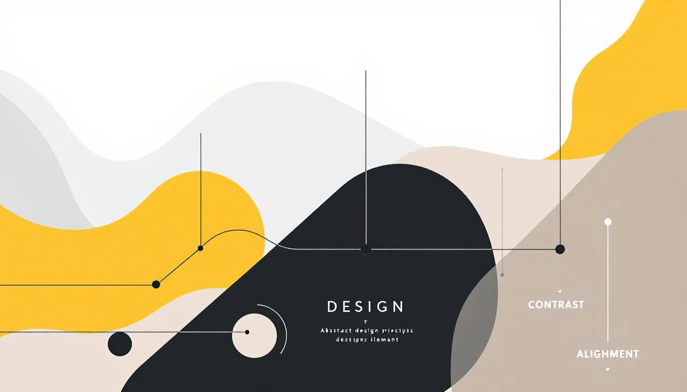
Design matters because it shapes our interactions with the world. The foundational elements of art, such as line and organic shapes, serve as tools for artists to compose their works. These elements are the building blocks that, when arranged according to certain principles, generate effects and convey the business’ messages artistically. Successful designs – especially when it comes to mobile apps and web apps – often exhibit a balance between unity and variety, enhancing viewer engagement.
Contrast is another crucial element in art as it differentiates elements, drawing the viewer’s focus to key areas. The interplay of principles like emphasis and movement can significantly influence the overall impact of a piece. Understanding and applying these principles can make the important distinction between a design that merely looks good and one that is truly effective and engaging.
In graphic design, these basic principles guide the arrangement of visual elements to create a cohesive and appealing composition. Mastering these graphic design rules enables designers to create works that capture attention and communicate messages clearly and effectively.
The blog will further delve into each of these principles in detail, providing practical tips and examples to help you apply them in your own design projects.
Principle 1 – Emphasis
Emphasis, also known as dominance, is a principle of design used to draw attention to specific elements within a composition. Creating a focal point helps guide the viewer’s attention to the most important parts of the design. This principle plays a crucial role in ensuring that the viewer quickly and easily absorbs the key information.
One of the most effective ways to create emphasis is through:
- Size: Making an element larger than others signals its importance and draws the viewer’s eye.
- Color: Using contrasting colors can make important text or elements stand out.
- Contrast: Achieved through varying shapes and placements, directing focus to desired areas of the design.
Novelty in design elements can also capture viewer’s attention by presenting something unexpected or visually unique. Combining these techniques helps create hierarchy within compositions, drawing viewers towards the most important elements first.
A common example of contrast in mobile apps or web platforms is the use of distinct colors for Call-to-Action (CTA) buttons. Surround the button with ample white space (or negative space) to isolate it from other elements, preventing visual clutter and ensuring the user’s eye goes directly to it
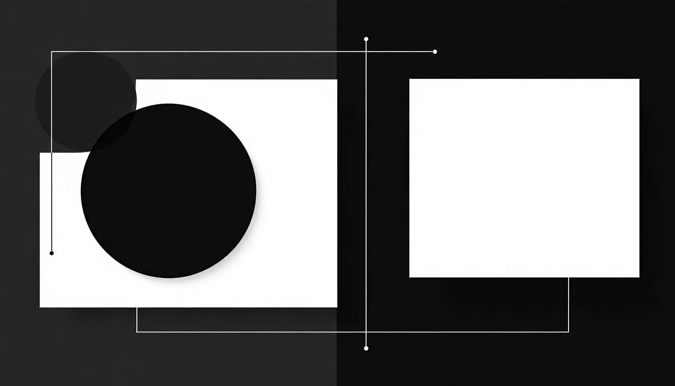
Principle 2 – Balance and Alignment
Balance in design refers to the distribution of visual weight across a composition. It is a fundamental principle that ensures a design feels stable and aesthetically pleasing. Without proper balance, a design can look chaotic and unappealing.
There are three types of balance:
- Symmetrical balance: involves equally weighted elements aligned on either side of a center line, creating a mirror image effect.
- Asymmetrical balance: uses elements of varying visual weight to create equilibrium without identical halves.
- Radial balance: organizes elements around a central point, drawing attention toward that area.
The goal of incorporating balance in design is to achieve a sense of equilibrium. This creates a visually pleasing effect. Balance and alignment are essential for clear and effective visual communication, helping to guide the viewer’s eye through the composition in a logical and cohesive manner.
The best example of alignment in web and app designs in action is a product page on an e-commerce site where all product images, titles, prices, and buttons are perfectly aligned in a grid. This organization makes it easy for users to compare items and quickly find the information they need.
Principle 3 – Contrast for Visual Impact
Contrast is the principle that makes design elements stand out, creating visual interest and enhancing readability. It involves the differences in shapes, size, and texture that draw the viewer’s attention and create visual hierarchy.
High contrast makes design elements pop, ensuring they are easily noticeable. Bold contrasting color schemes can significantly enhance the visibility of key components, while texture contrast can add depth and dimension to a design. Utilizing contrast effectively can create a memorable and impactful visual experience, guiding the viewer’s eye through the design.
Contrast also plays a vital role in improving readability by establishing a clear distinction between background and text colors. Different types of contrast, such as size, shape, color, and black shapes, serve unique purposes in guiding viewer attention and creating balance within the composition.
For instance, a CTA button with a bright, vibrant color like blue or green stands out against a neutral background, such as white or gray. This high-contrast pairing immediately draws the user’s eye and makes it clear where they should tap to perform an action, like “Sign Up” or “Buy Now.”
Principle 4- Power of Repetition
Repetition involves repeating elements within a design to create unity and strengthen the overall composition. Consistently using certain design elements fosters familiarity and reinforces brand identity, creating a strong motif for logos and materials.
Consistent repetition guides the viewer’s eye across the design, creating a sense of rhythm and cohesiveness. However, repetition should be balanced with other principles like contrast and variety to avoid a design that becomes monotonous or overly predictable.
Combining different patterns can lead to harmony, as long as they share a cohesive color scheme. Excessive or insufficient repetition can lead to a boring or disjointed design, so finding the right balance is key to maintaining visual interest and cohesiveness.
For instance, a mobile app designer might use a specific icon or color for all important alerts, training the user to immediately recognize and pay attention to these notifications.
Principle 5 – Proportion and Scale
Proportion in design refers to the size and scale of elements and how they relate to each other within the composition. Effective proportion contributes to a sense of balance and harmony, making the design more visually appealing.
Larger elements are often perceived as more important than smaller elements, allowing designers to create hierarchy and draw attention to a certain element. Altering the size and scale of various elements can also create a sense of depth, making the design more dynamic and engaging. Certain elements can enhance this effect.
Approaching design in sections rather than as a whole can help in achieving effective proportion. Thoughtful sizing and placement of disparate pieces and elements ensure that the overall look and feel of the design is balanced and cohesive.
Principle 6 – Oculesics
In design:
- Movement directs the user’s eye across the composition, creating a clear visual flow.
- Effective use of contrast highlights key information and enhances viewer engagement.
- Utilizing the human eye scale ensures that the sizes of design elements are relatable to viewers, influencing their interaction with the design.
Incorporating various textures can create depth while preserving harmony, guiding the viewer’s attention through the design. Effective use of white space can also help guide the viewer’s eye, ensuring important features stand out. Without proper movement, designs risk becoming confusing. This disorientation can lead to a failure in effectively communicating the intended message.
A great example of oculesics in design is the use of eye-tracking in advertising. In an ad featuring a person, if the person in the ad is looking directly at the viewer, it creates a sense of connection and engagement. If the person is looking at a product or a specific piece of text on the ad, the viewer’s eye tends to follow their gaze.
Principle 7 – White Space

White space, also known as white space or negative space, is the area in a design that is left as an empty area, providing a cushion and lightness to the composition. Positive space and negative space can take on any color, as long as they remain free of visual elements.
Effective use of white space promotes clarity by allowing users to distinguish between related elements. It helps create balance, contrast, and visual hierarchy within a design, making it more visually appealing and easier to navigate.
Micro white space enhances legibility by providing necessary spacing between letters and lines, while macro white space encompasses larger empty areas that help in delineating different sections of a design. Too little white space can lead to a cluttered and confusing appearance, detracting from the overall design.
Principle 8 – Unity and Harmony
Unity in design refers to creating harmony and cohesion between visual elements, ensuring that all parts work together cohesively. Repetition serves to connect different design parts, creating a unified theme and enhancing overall coherence.
Visual unity and conceptual unity are both crucial. Visual unity focuses on aesthetics, while conceptual unity emphasizes the idea conveyed through the design. Assessing whether each design element enhances the central message is vital for achieving unity in the overall composition.
Creating unity and harmony ensures that compositions are aesthetically pleasing and effectively communicate the core message. This principle plays a key role in achieving visual harmony and creates a sense of the natural order of impactful design to achieve the desired effect.
Principle 9 – Pattern and Rhythm
Pattern refers to repeating multiple elements in a consistent way, creating visual interest through the interplay of colors, shapes, and textures. Through repetition, patterns establish harmony in design.
Rhythm in design is established through repeated elements and can dictate the pace at which the viewer’s eye moves. Rhythm creates can be created through repetition and spacing of elements, allowing for a dynamic and engaging visual experience.
There are different types of rhythm, such as:
- Regular rhythm: employs consistent intervals.
- Flowing rhythm: reflects natural motions, resembling curves and waves.
- Progressive rhythm: alters one characteristic of a motif in each repetition, enhancing depth perception.
- Random rhythm: involves repeating elements at inconsistent intervals, creating a dynamic visual rhythm effect.
Principle 10 – Variety for Visual Interest
Variety in design refers to incorporating visual differences and contrasts to add visual interest. The ultimate goal when using variety in design is to strike a compelling balance between interest and consistency.
Too much repetition can lead to monotony, so adding unexpected elements can prevent a design from feeling overly repetitive. This enhances both unity and personal expression, making the design more engaging and dynamic.
By incorporating variety, designers can create compositions that are not only aesthetically pleasing but also captivating and memorable. This principle plays a key role in maintaining visual interest and keeping the viewer engaged, as it is used to create a dynamic experience.
On a web app, variety can be used to differentiate sections and make complex data more digestible. For instance, a dashboard for a data analytics platform might use different types of charts and graphs—a bar chart for one dataset, a line graph for another, and a pie chart for a third. This variety not only presents the information in the most appropriate format but also makes the dashboard visually interesting and easier to scan.
Prometteur Takes Design Thinking Seriously
Prometteur is the perfect choice for all your UI/UX, design, and art requirements. Their expertise in design principles ensures that they create visually appealing and effective designs that meet your needs.
Partnering with Prometteur means benefiting from their unique selling points, such as their in-depth understanding of design principles and their ability to create cohesive and impactful designs. They take design thinking seriously, ensuring that every project is approached with creativity and precision.
Key Takeaways
Understanding that design is a journey rather than a destination is crucial for effective problem-solving in a design system. Embracing exploration and curiosity is essential, as there is rarely a single correct solution in design.
Sketching serves as a vital tool for externalizing ideas, facilitating a conversation between problems and solutions. Adopting an optimistic mindset can transform perceived failures into valuable learning opportunities.
Successful design hinges on accurately identifying the right problems to solve, rather than merely providing solutions. Collaborative design approaches can lead to more innovative solutions, benefiting from diverse perspectives. Focusing on specific design principles can help in the detailed development of design concepts.
Frequently Asked Questions
What is the principle of emphasis in design?
The principle of emphasis in design is essential for directing the viewer’s attention to key elements, establishing a focal point that highlights the most important aspects of the composition. This technique enhances the overall effectiveness of the design by ensuring clarity and focus.
How does balance and alignment affect design?
Balance and alignment are essential for achieving visual harmony and equilibrium in design. They contribute to a more aesthetically pleasing composition by ensuring the distribution of visual weight is well-managed.
What is the role of contrast in design?
Contrast is essential in design as it improves visibility and readability by differentiating shapes, sizes, and textures, thereby enhancing visual interest. Employing contrast effectively can significantly elevate the overall impact of your design.
How does repetition strengthen a design?
Repetition strengthens a design by creating unity and familiarity through the consistent use of elements, ultimately reinforcing brand identity. This approach helps to create a cohesive visual experience for the audience.
Why is white space important in design?
White space is crucial in design as it enhances clarity and visual hierarchy, enabling users to easily differentiate between elements and preventing clutter. Emphasizing white space leads to more effective and aesthetically pleasing designs.